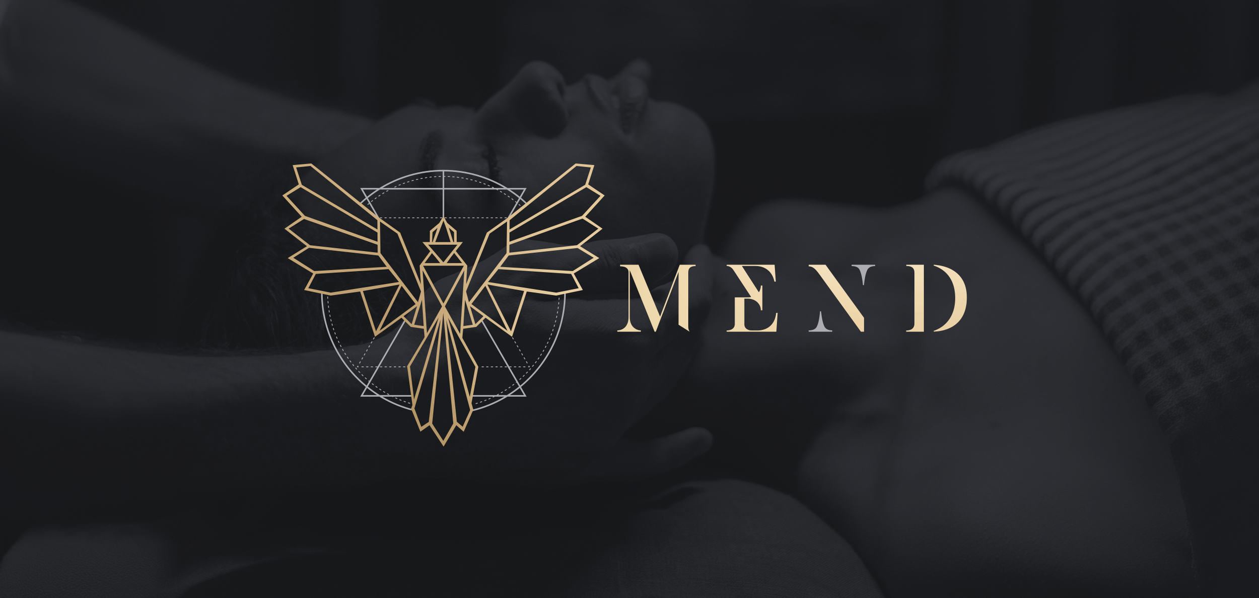
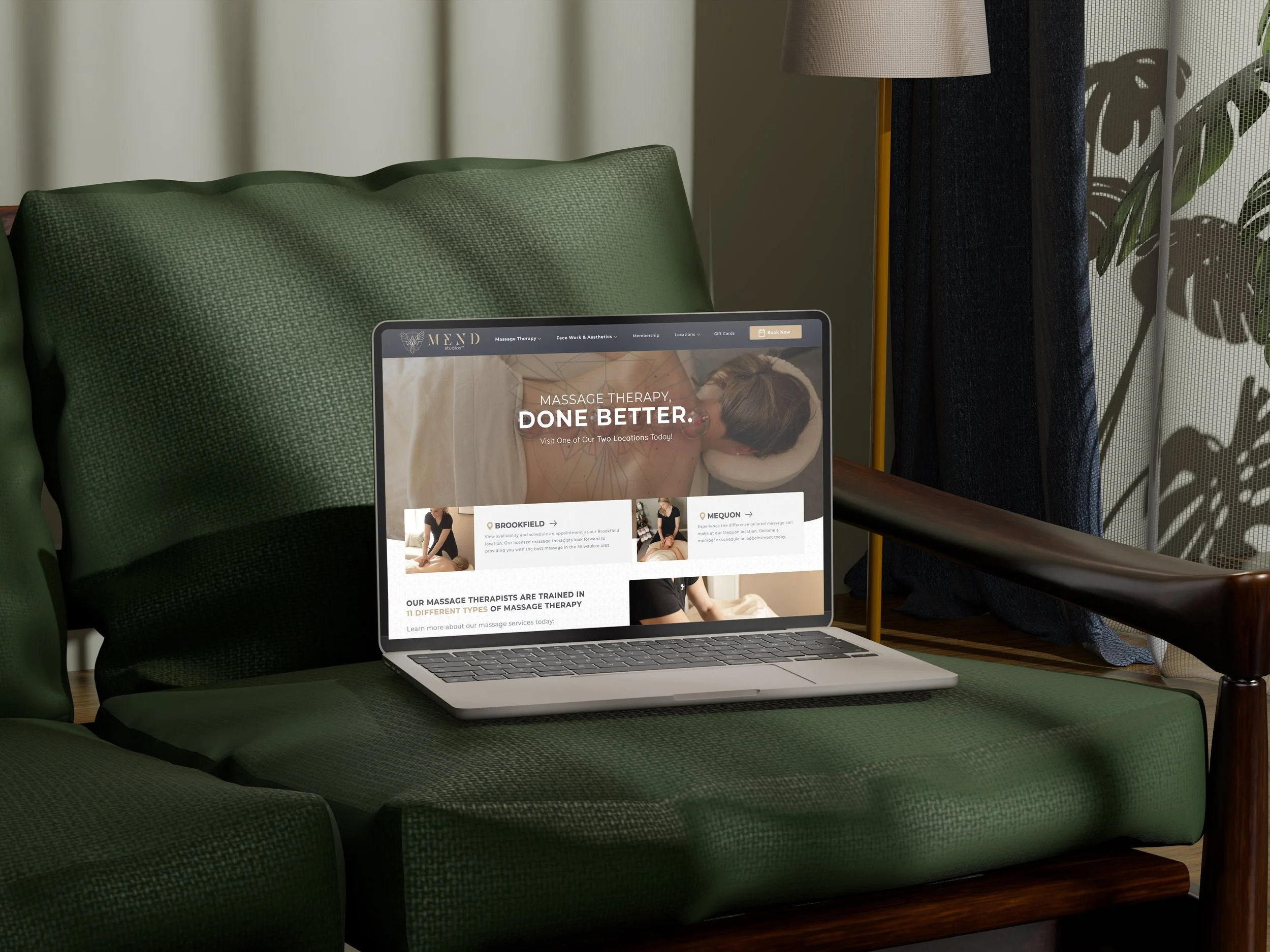
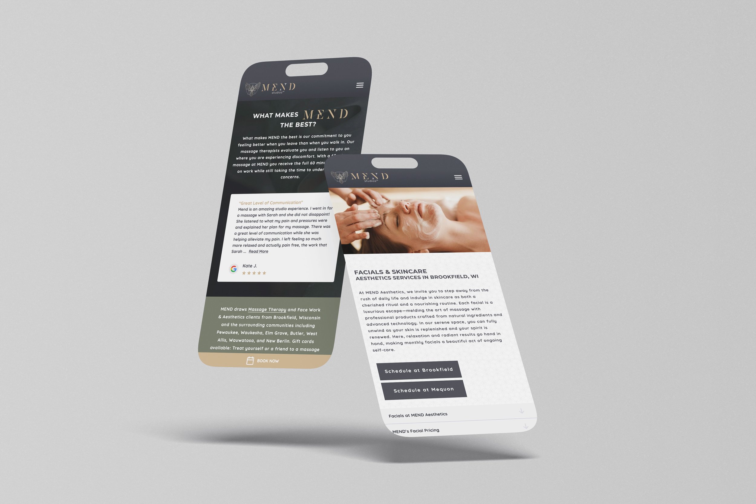
MEND STUDIOS
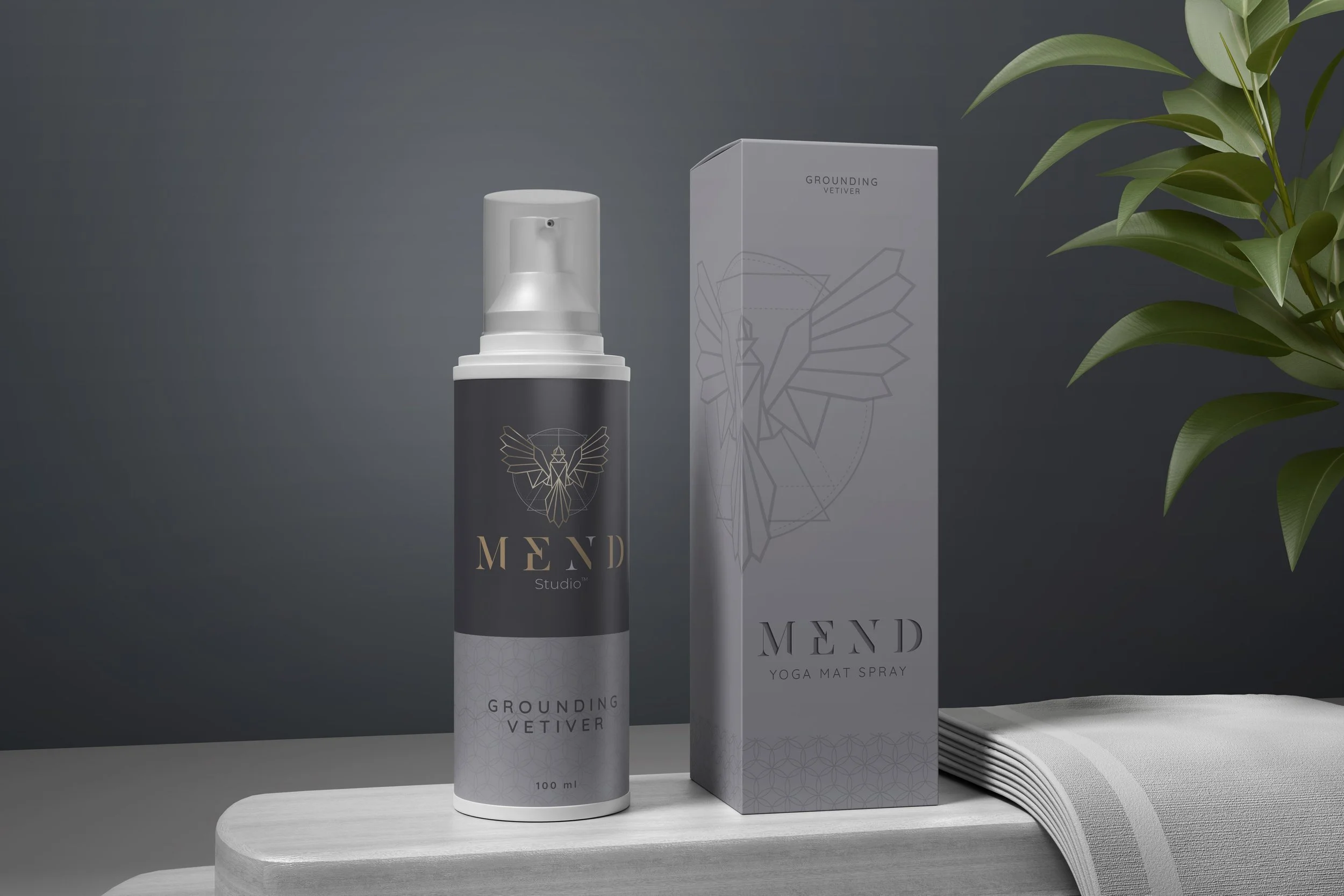
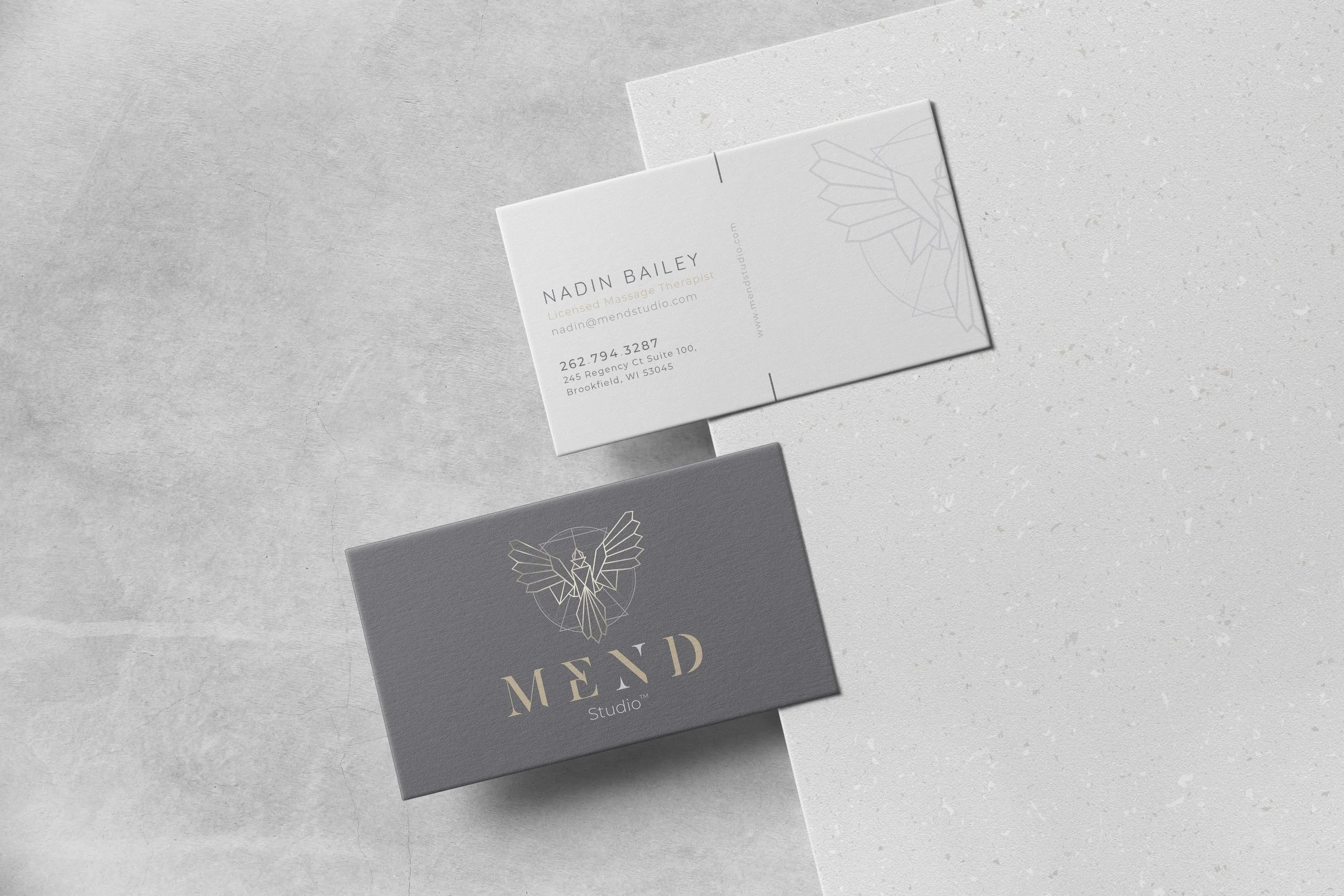
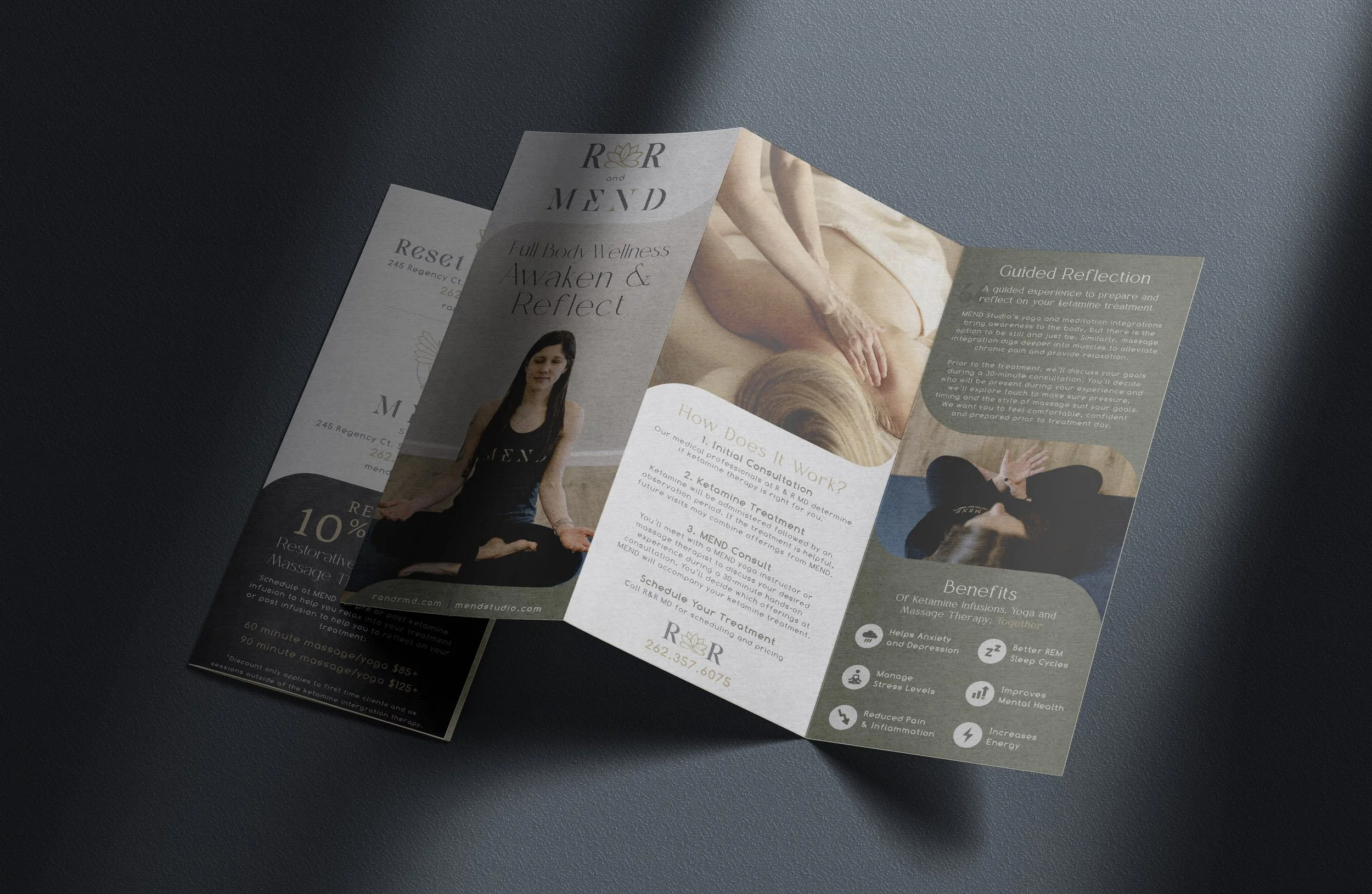
When MEND approached iNET, they were looking for a logo that would define the essence of their brand. The client was drawn to the symbolism of the phoenix—rebirth, renewal, and inner strength. As Design Lead, I developed an identity rooted in that vision. The original concept leaned into organic, fluid lines, but we refined it into a more geometric style to align with sacred geometry—bringing structure, balance, and a modern edge to the holistic feel. This visual identity became the foundation for a cohesive brand system, including a custom website, brochures, business cards, and essential oil packaging. The new branding not only helped establish a strong presence in the wellness community but also contributed to the success of launching a second location and growing a loyal membership base.
Client: Mend Studios | Agency: iNET | Role: Design Lead
Concept development, branding, logo design, website, and marketing collateral